Visualizing Flight Data With Basemap
While browsing Awesome Datasets I came across OpenFlights dataset, a public database containing flight data from around the world. We all talk about having the world at our fingertips. While looking through the dataset, I wondered how connected I am, physically, to other parts of the world. If I wanted to leave San Francisco today, where would I be able to go? Armed with the OpenFlights dataset, I set off to find my answer.
Installing Basemap
It was a sad day when ArcGIS license expired. Luckily, there are plenty of visualization tools out there that can fill my geographical visualization needs (for free!). One of them is Matplotlib’s Basemap Toolkit. Basemap uses the Proj library to convert coordinates into different map projections and then plots the maps in the transformed coordinates using Matplotlib.
Installation was a bit tricky because I run Python 3.6 on my machine and Basemap requires Python 2.7. I decided to create a new environment with Python 2.7 in anaconda and installed Basemap there.
conda create --name py2 python=2.7
activate py2
conda install basemap
With that, Basemap was all set to go! To check to make sure that Basemap was functional, I played around with it for a bit and created a plot using bluemarble, which uses the NASA Blue Marble image as a map background.
import matplotlib.pyplot as plt
from mpl_toolkits.basemap import Basemap

fig, ax = plt.subplots(figsize=(12,15))
m = Basemap(width=12000000,height=9000000,projection='lcc',
            resolution=None,lat_1=45.,lat_2=55,lat_0=50,lon_0=-107.)
m.bluemarble()
plt.show()
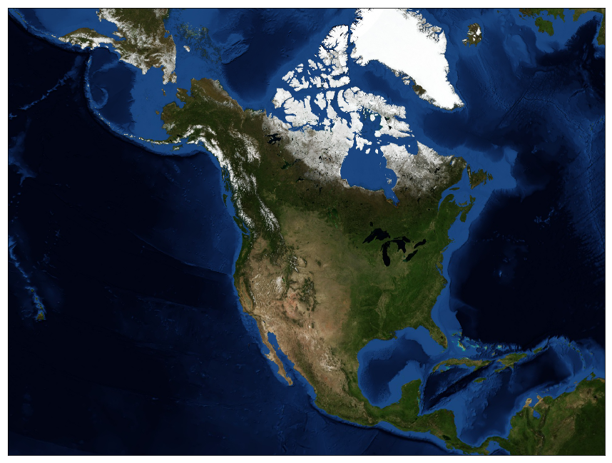
A view of North America with the NASA Blue Marble image as a background.
Visualizing Airport Data
I was now ready to start visualizing some of the data from the OpenFlights dataset. I started by downloading the Airport and Route files from the OpenFlights website. I decided to use a Mercator projection, the standard map projection. The Airport file comes with the airport longitudes and latitudes in Cartesian coordinates, but that was easy enough to fix using Matplotlib. With the longitudes and latitudes in a readable format, I created a scatter plot to visualize the airports around world.
import pandas as pd

airports = pd.read_csv("airports.csv",
                names=["ID", "Name", "City", "Country", "IATA", "ICAO",
                "Latitude", "Longitude", "Altitude", "Timezone", "DST",
                "Tz",  "Type", "Source"])
routes = pd.read_csv("routes.csv",
                names=["Airline ID", "Source airport", "Source airport ID",
                "Destination airport",  "Destination airport ID", "Codeshare",
                "Stops", "Equipment"])
longitudes = airports["Longitude"].tolist()
latitudes = airports["Latitude"].tolist()
fig, ax = plt.subplots(figsize=(15,20))
plt.title("Airports Around the World")
m = Basemap(projection='merc', llcrnrlat=-80, urcrnrlat=80,
            llcrnrlon=-180, urcrnrlon=180)
x, y = m(longitudes, latitudes)
m.scatter(x,y,s=1)
m.drawcoastlines()
plt.show()
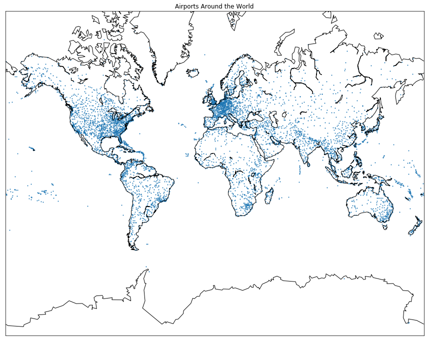
A scatter plot showing airports around the world. Note the high density of airports on the East Coast and in Europe.
One of the drawbacks of Basemap is that if I wanted to visualize connections between points, I can only draw them if they are contained within the map. This means that on this map I could draw a flight from America to Europe, but not a flight crossing the ocean from America to Asia, since that flight would have to wrap around to the other side of the map. Because of this, I decided to limit my visualization to flights within the United States.
USA Geographic and Flight Information
I wanted to create a plot where only the United States were visible, not Canada or Mexico. Basemap has the ability to read in shapefiles, so I headed over to the []US Census webpage](https://www.census.gov/geo/maps-data/data/tiger-line.html) and downloaded their shape file for the states. After searching online, I was able to find the coordinates for the four corners of the United States and plotted the map using Basemap.
fig, ax = plt.subplots(figsize=(15,20))
m = Basemap(llcrnrlon=-119,llcrnrlat=22,urcrnrlon=-64,urcrnrlat=49,
        projection='lcc',lat_1=33,lat_2=45,lon_0=-95)
shp_info = m.readshapefile('tl_2017_us_state','states',drawbounds=True)
After looking into the Route file I downloaded from OpenFlights, I realized that the file did not contain the Latitude or Longitude data for the Source airport or the Destination airports. I was only interested in flights from SFO, so I filtered out routes based on the source airport, then added the latitude and longitude coordinates to the routes file.
routes_sfo = routes[routes["Source airport"]=="SFO"]
src = routes_sfo['Source airport']
end = routes_sfo['Destination airport']

def find_coords(col, lat_or_lon):
    newCol = []
    for i, row in col.iteritems():
        cols = (airports[airports['IATA']==row])
        val = cols[lat_or_lon].iloc[0]
        newCol.append(val)
    return newCol
routes_sfo.loc[:, 'src_lat'] = find_coords(src, "Latitude")
routes_sfo.loc[:,'src_lon'] = find_coords(src, "Longitude")
routes_sfo.loc[:,'end_lat'] = find_coords(end, "Latitude")
routes_sfo.loc[:,'end_lon'] = find_coords(end, "Longitude")
Now that I had the information for the source airports and the destination airports, I wanted to draw great circles between them. I didn’t have a list of airports in the United States, so I decided to try adding great circles based on whether the destination airport was within the bounds of the map or not. When I did this, however, the map turned out funky
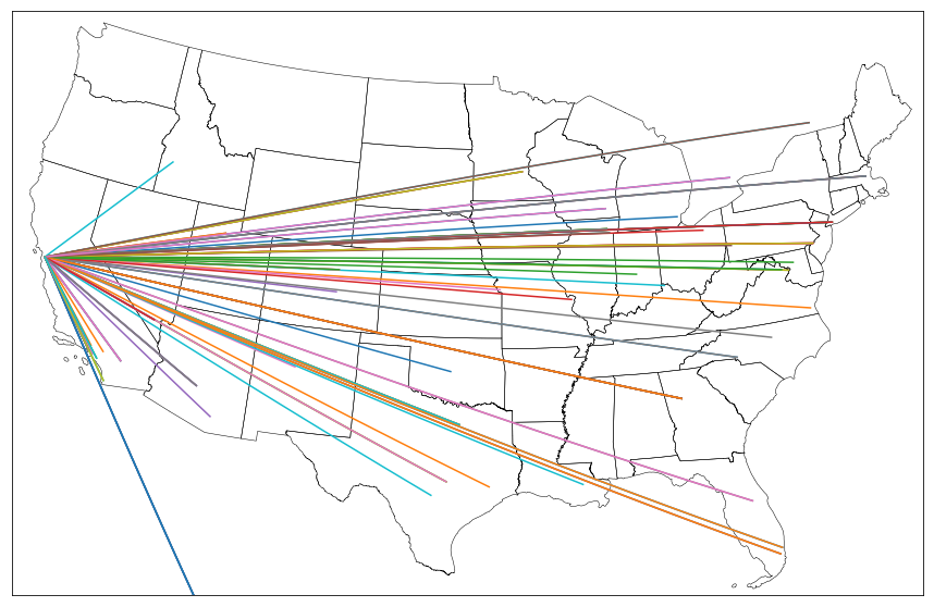
The plot included flights to other destinations in the US, but also had flights to Canada and Mexico.
There had to be a better way to do this.
Valid Flights with Reverse Geocoder
While looking for a solution to this problem, I found Ajay Thampi’s Reverse Geocoder python library. I decided to refine my find_coords method to call Reverse Geocoder to find whether the airports were located in the US.
def create_great_circles(df):
    src_lat = df['src_lat'][0]
    src_lon = df['src_lon'][0]
    coords = []
    for index, row in df.iterrows():
        end_lat, end_lon = row['end_lat'], row['end_lon']
        coords.append((end_lat, end_lon))
    results = rg.search(coords)

    for i, res in enumerate(results):
        if results[i]['cc']=='US' and results[i]['admin1']!='Hawaii':
            m.drawgreatcircle(src_lon, src_lat, float(results[i]['lon']),
                              float(results[i]['lat']))
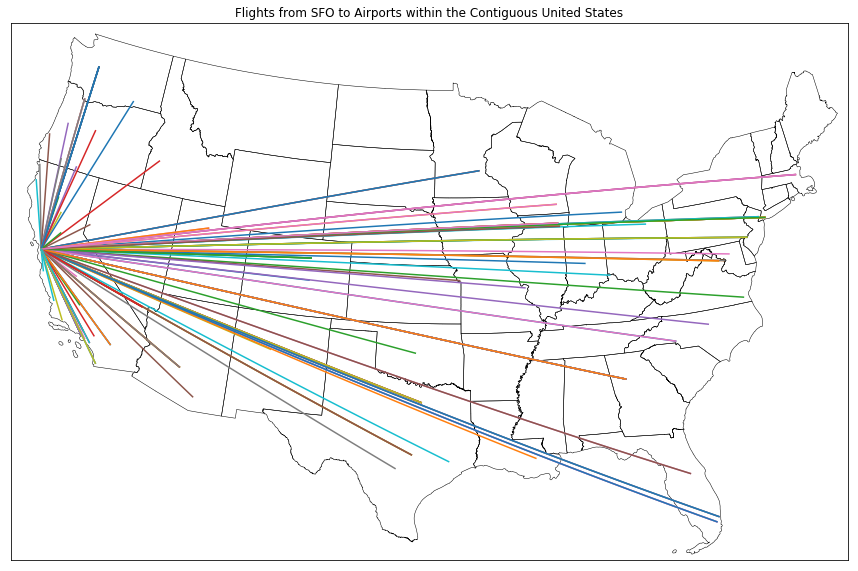
Yay! Plot finally worked!
From these plots, it’s clear that there are plenty of places in the US that I can get direct flights to! AMERICA IS ACTUALLY AT MY FINGERTIPS!! Now to start saving money and planning for my next vacation…